
Mobile Layout Grids
Design
Aug 28, 2024
The Grid Revelation: My Journey from Chaos to Order
You know that feeling when you stumble upon something that just... clicks? That's how I felt when I discovered mobile layout grids. Don't get me wrong, I appreciate a beautiful, aesthetic design as much as the next person. But when it comes to SaaS platforms and apps that need to actually, you know, function? Give me symmetry and organization any day.
I remember the days when I'd spend hours trying to achieve that perfect "randomly positioned elements" look. Sure, it looked cool, but making it responsive? Forget about it. And don't even get me started on trying to maintain consistency across different pages. It was a nightmare.
Then I discovered layout grids, and it was like someone turned on the lights in a dark room. Suddenly, everything made sense. My designs weren't just pretty – they were logical, consistent, and (hallelujah!) easy to make responsive.
Grids 101: The Building Blocks of Sanity
Now, I know what you're thinking. "Grids? Sounds boring." But trust me, once you get the hang of them, they're like a superpower. Here's a quick rundown of the key players:
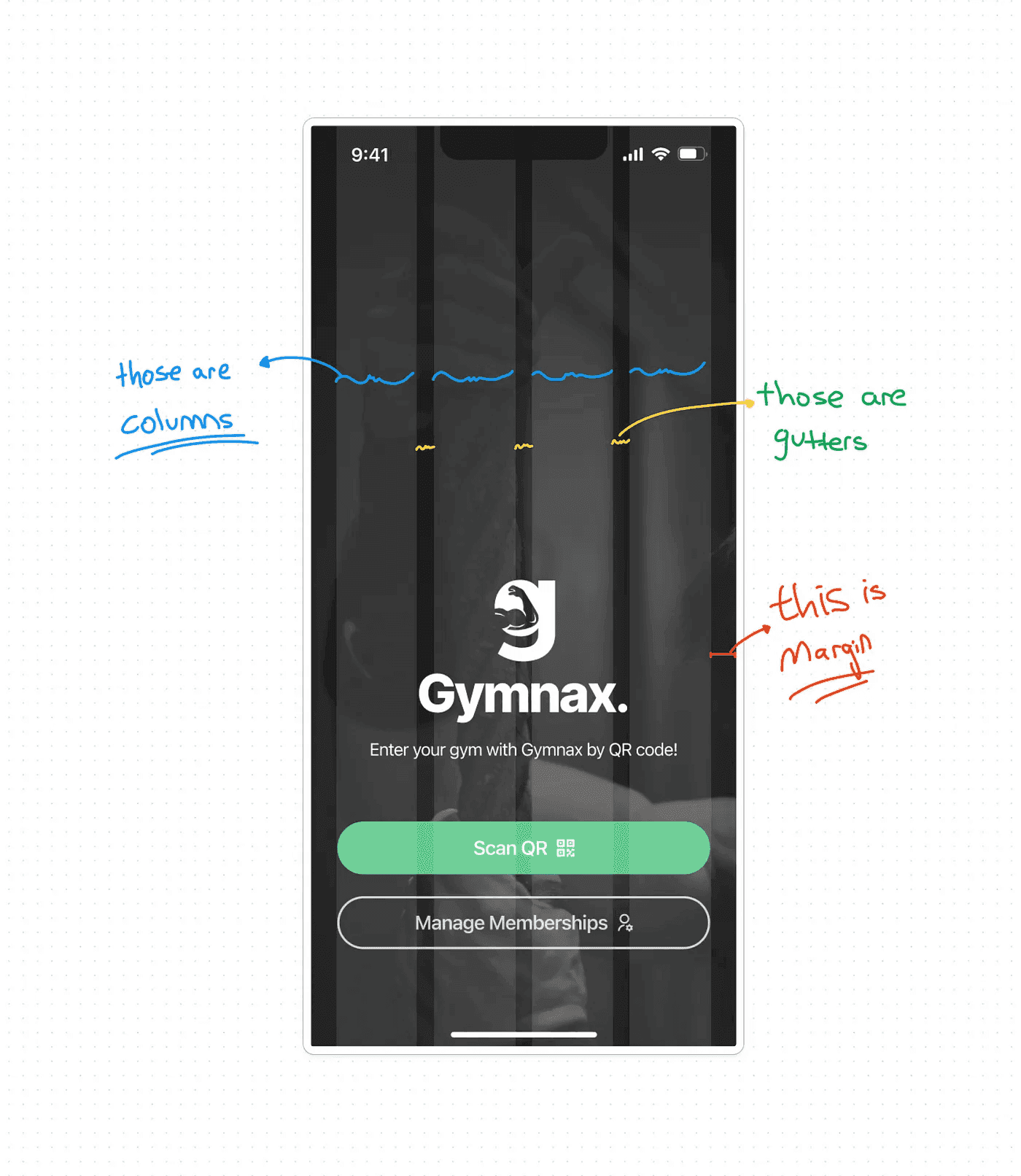
Columns: These are your best friends. They divide the screen into equal parts, giving you a structure to work with.
Rows: Optional, but super handy for aligning elements horizontally.
Margins: The space on the left and right edges. Trust me, you want these to keep your design from feeling claustrophobic on different devices.
Gutters: The space between columns. I usually stick with 16px, but you do you.
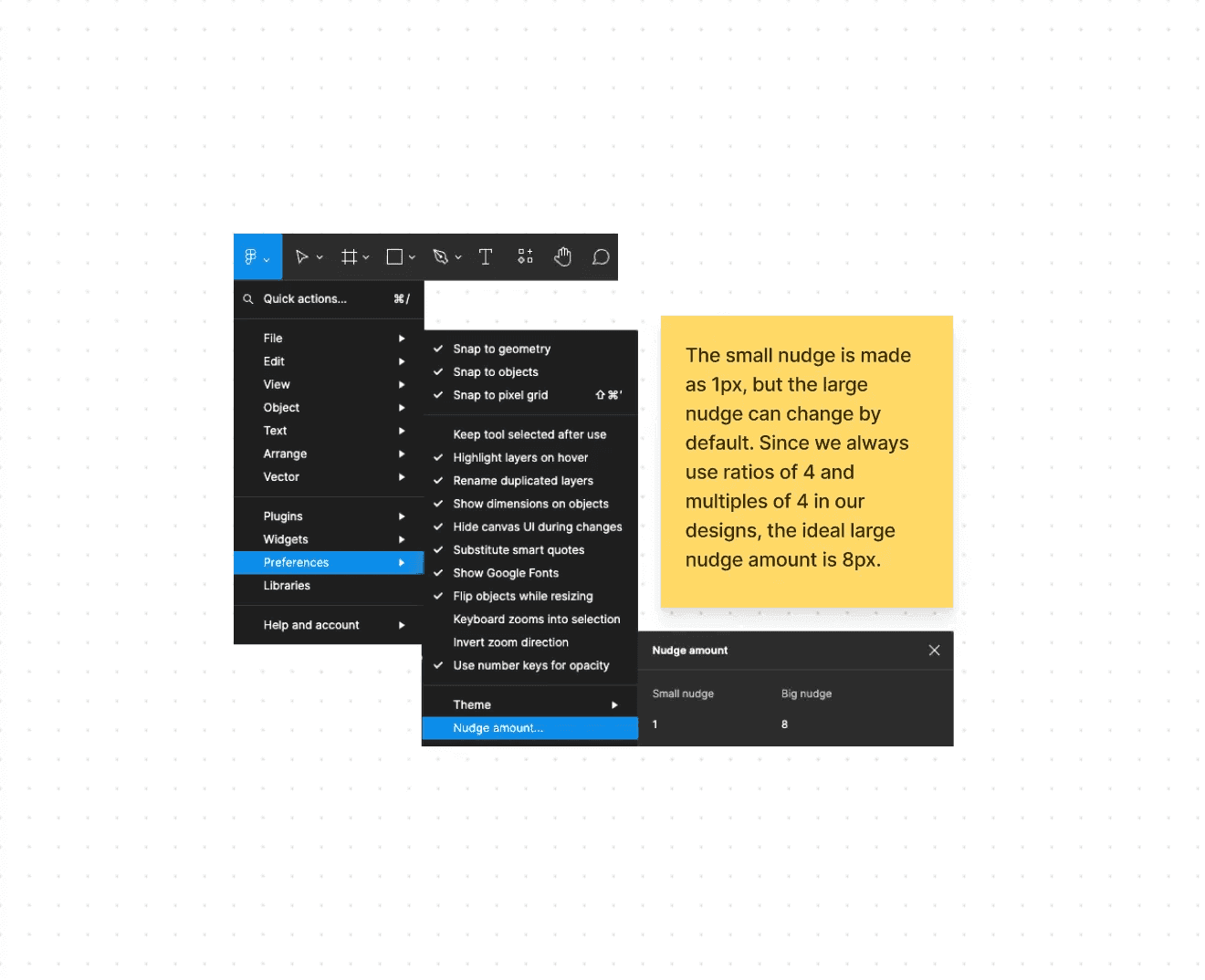
And here's a pro tip: In Figma, set your "Nudge Amount" to 8px. Why? Because we often use multiples of 4 in design, and 8 is a nice, even number to work with.
Making the Magic Happen in Figma
Ready to join the grid side? Here's how to set up a mobile layout grid in Figma:
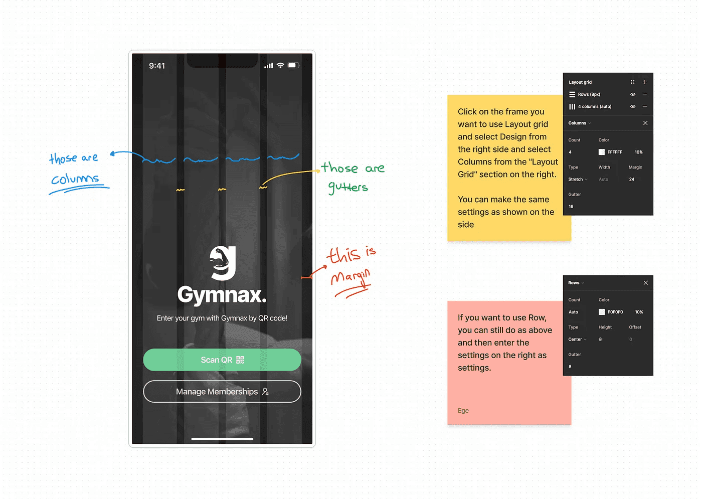
Select your frame
In the right sidebar, find the "Layout Grid" section
Click the "+" to add a grid
Set it to "Columns"
Play with the numbers until it feels right. I often use 4 columns with 16px gutters and 16px margins for mobile designs.
And voila! You're gridded and ready to go.
Look, I get it. Brutalism is trendy. It's edgy. It makes your design look like it's too cool to care. But when it comes to creating functional, scalable designs that won't give you a headache down the road? I'll take my trusty grid any day.
So go ahead, embrace the grid. Your future self (and your users) will thank you.
What about you? Are you a grid convert, or do you prefer to live on the wild side? I'd love to hear your thoughts!