

I wanted my very first blog post to be something genuinely useful. So I decided to share, as a designer, how I deliver design work faster. When I first started I already knew about UI kits, but I had no idea how to use them well.
The point of this post is to explain how you can use a UI kit correctly while still keeping your designs feeling original.
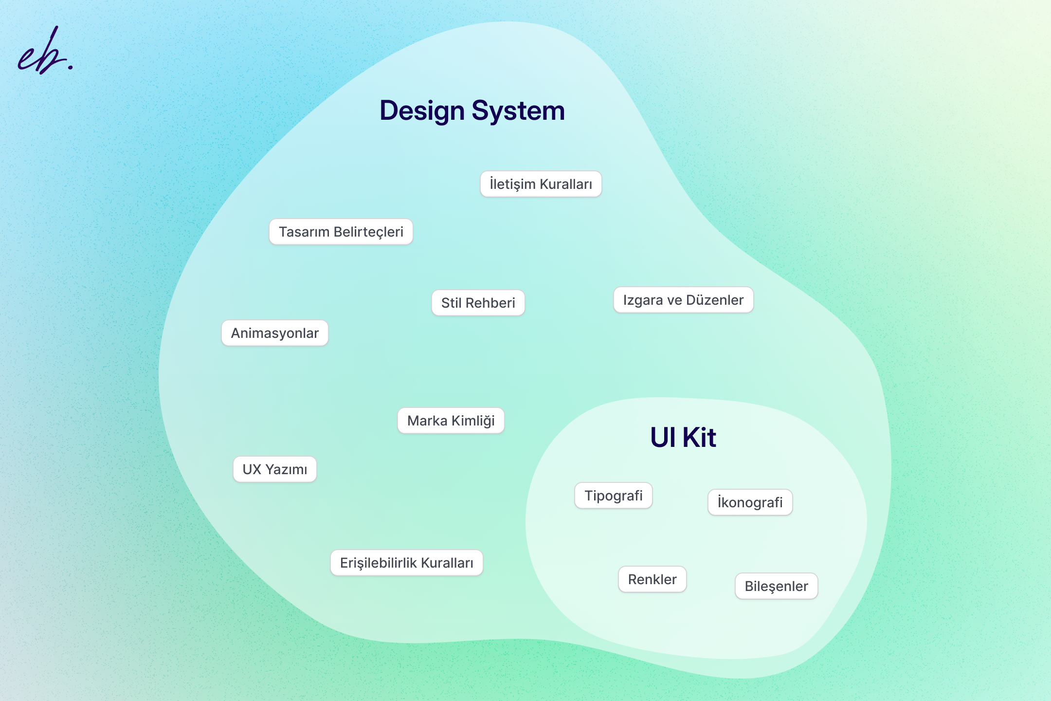
What is a UI kit?
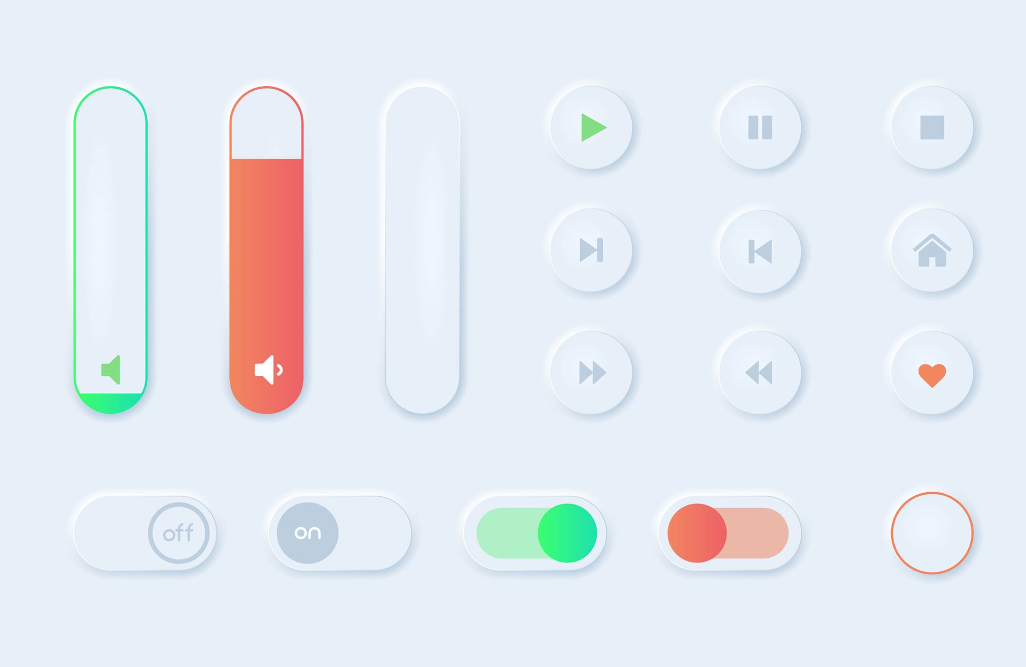
A UI kit is, at its core, a design file that bundles together many design components, things like buttons, form inputs, table patterns, and so on.
Most kits live in Figma. The components inside are wired to typography styles and color palettes from the same file. So if the kit ships with "dark blue" as its primary and your brand is pistachio green, you can swap every primary surface, every shadow, every border and every text color in the whole file with a single click. The same applies to fonts.
In short, with a five-to-ten minute pass over fonts and colors you can have every element you need for the entire project ready automatically.
UI kit vs. design system
A UI kit is basically a collection of ready-made design components (buttons, forms, tables, etc.). The components inside a Figma kit are wired together with typography and color palette libraries.
A design system is broader. It covers the components, of course, but also the design principles, brand rules, UX guidelines, and coding standards. It is the living system that keeps a company's digital products consistent over time.
A UI kit answers the "what" (which components do we use). A design system also answers the "how" and the "why" (how and when do we use these components).
Why use a UI kit
When you make UI kits part of your design process you gain in several ways: efficiency, speed, consistency, and saved time downstream in development. Specifically:
Faster design loops
The single biggest thing a UI kit does is stop you from reinventing the wheel. In four years of design work, the thing I have enjoyed least is redrawing the same form inputs over and over. They are all slight variations on each other and rebuilding them every time burns real time. Starting from a brand-appropriate UI kit makes that part trivial.
Swap colors, typography, and border-radius and you can have a full component set ready in minutes.
Brand consistency
Consistency is one of the most important things in a design project. Users should feel the same rhythm as they move from one screen to the next. Feeling like you have wandered into a different site, or losing brand identity on the way, is a bad outcome for both the user and the product owner.
Easier team collaboration
If you are not the only designer on the project, handing the next designer a working component library both makes their job easier and protects brand consistency.
Less work for engineers
If you tailor a UI kit to your project before you start designing, you can hand it to your engineer at the same time so they can start in parallel. While you are designing pages, they are turning the components into code. On time-constrained projects this is the difference between hitting a deadline and missing it.
The trade-offs to know about
It is not all upside. UI kits come with their own pitfalls.
They can flatten your creativity
The most common criticism of UI kits is that the convenience comes at the cost of creativity. That is fair. Cranking out solid designs quickly can crowd out the spark. Even when the structure is different, the output can start to feel templated. I felt this a lot early on, less now.
If a client shares references that all use single-color backgrounds, subtle brand accents, and a noise texture, using Material UI to draw flat white cards on flat colors is clearly the wrong call. You either tailor the kit to the client direction or add the missing designer touch on top of it.
Project-specific needs
If your plan is to use nothing but the components inside a UI kit, save your money. A design exists to solve a problem; the surface you ship has to be specific to that problem. A UI kit cannot do that for you.
A modal box from a UI kit gives you the blur and the panel shell. Everything inside that panel still has to be designed by you. That is not a bug, that is the point.
How to pick a UI kit
There are literally hundreds of UI kits out there, some priced at $100+. So how do you pick? I follow a small handful of rules.
I do not buy every kit. I do not buy a project-specific kit when I already own a comprehensive one. And I do not buy a kit just because it has everything.
The list below is ordered from most to least important for me.
How long the kit has been around
Brand new kits tend to lean into whatever the current design trend is. That is the single thing I watch out for most. A kit that drops today and leans hard into the current trend is a bad long-term investment.
My preference is a kit with a quieter visual language, like:
Older kits also tend to have a more established community and evolve along with that community's needs. The kit designer is making safer, more tested decisions.
How customisable it is
As I said above, I avoid kits that are tightly coupled to a specific trend. I prefer a kit with simple, neutral elements that I can customise into whatever the project needs.
The point of a UI kit is not to ship the final design as-is. The point is to avoid rebuilding the same building blocks from scratch every time.
Update cadence
A kit that updates too often is bad. A kit that never updates is also bad. The sweet spot is a kit that ships large, deliberate updates a few times a year. Constant updates make your local library go stale and chasing them is exhausting.
When I bought my favourite kit, Untitled UI, it was on v4. A few months later Figma shipped variables and tokens. The kit caught up to that change in about a month with a clean v5 release. That is the cadence I want.
Premium UI kits worth paying for
I will only recommend kits I have actually used. The order below is my personal preference, not a definitive ranking.
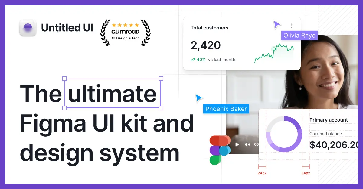
Untitled UI
My top pick, and the one I reach for most often. If I could only own one kit, this would be it.
Solid file structure, deep component library, a visual language I like, a healthy update cadence, and years of refinement. The one kit I can recommend without caveats.

SegmentUI
A kit I reach for when I am working in Framer. Simpler than Untitled, but if you do anything in Framer it will speed up both your design and your build.
The "custom Framer code components" library in particular is excellent. If you only get to pick one kit and you live in both Framer and Figma, this is the one.

Best free UI kit
There are thousands of free options. As a starting point for any project I would still recommend the free version of Untitled UI. The free version alone is better than most paid kits.
Not much to say beyond that, it is free, just grab it:

Closing
UI kits make a designer's life materially easier.
I have seen this directly in my own work, more time saved, more consistency in the output. It is true that they can feel like a constraint at first (they felt that way to me too), but with time they stop feeling like restrictions and start feeling like accelerants.
The most important thing is to pick a kit that matches your project and your needs, and to treat it as a starting point. Avoid reinventing the wheel; lay down the base structure with the kit, then layer your own design choices on top. That is how you ship designs that are both efficient and original.
A good UI kit does not limit you. It buys you the time you need to be more creative.